Role: Sole product designer (individual project)
Tools: Figma
Timeline: 8 weeks

Wanderlust is an iOS app designed to help people find new travel destinations and plan trips.
The problem I identified was how I could make the process of finalizing a vacation easier. From first discovering a desired destination, to choosing attractions to visit, and finally planning how to spend the limited time, planning a trip is a time-consuming process.
To gain more context on the challenges of trip planning, I conducted a survey among peers who have recently gone on an international trip or vacation. The questions asked were:
The takeaways of these questions were mainly in two categories: discovery and scheduling. While some travelers have a set destination in mind, many find themselves searching for the perfect destination that will give them just the experience they are looking for—this process requires long hours of searching through Google to find and narrow down the candidates. Additionally, scheduling and creating itineraries for these trips is tedious, and these schedules are often ineffective due to unpredictable factors such as time and travel.
To help users find destinations they would love, and make the planning process easier and more flexible.
KPIs: Number of trips created, number of destinations saved, in-app surveys (how accurately did you follow the itinerary?)
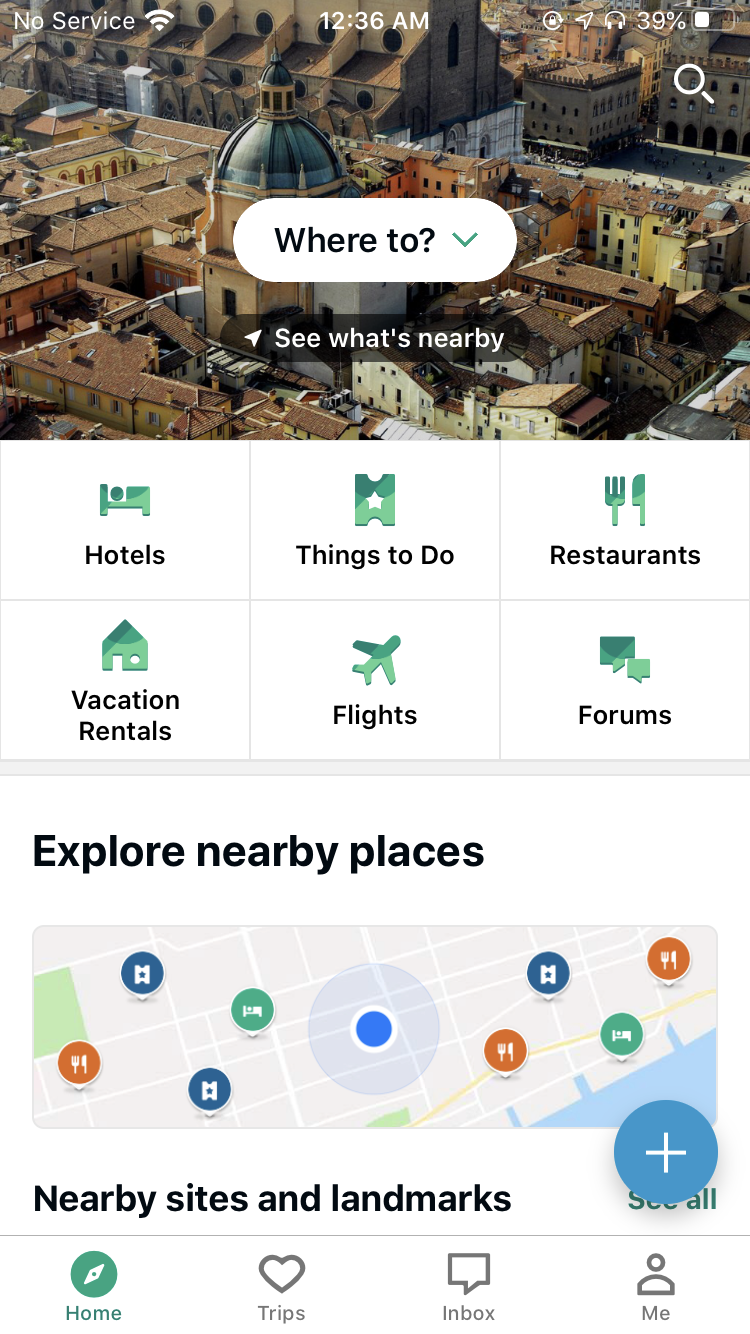
Strengths
Limitations
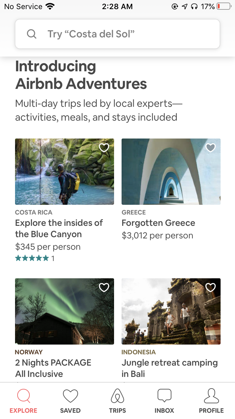
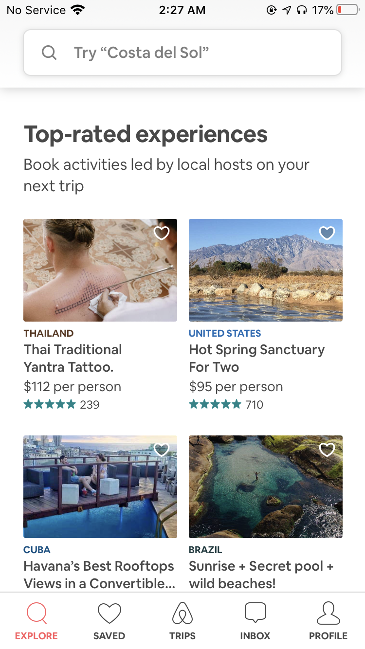
Strengths
Limitations
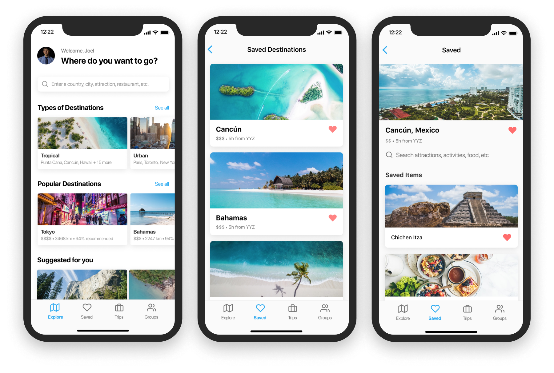
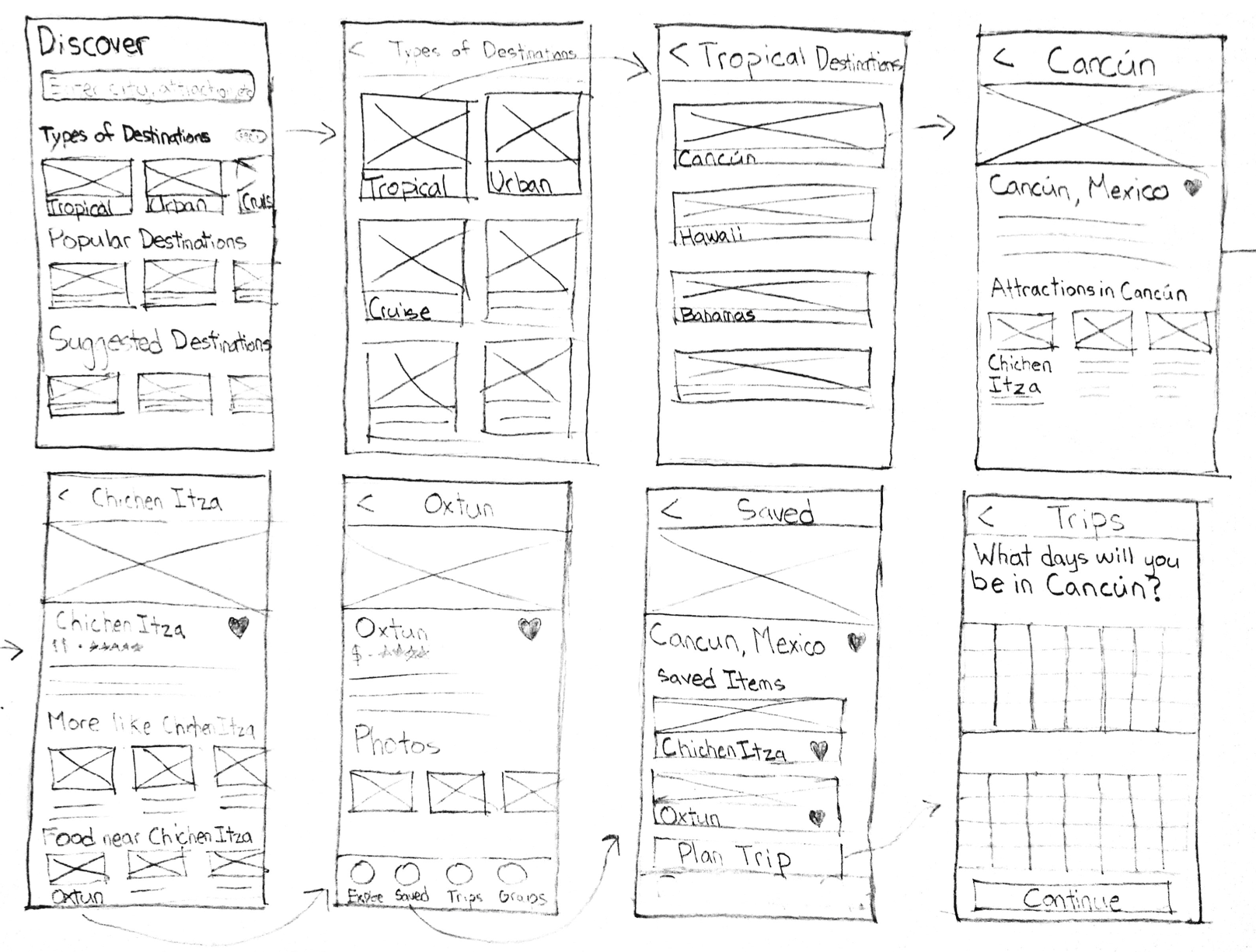
To form the wireframes of various pages of the app, a storyboard was created starting from discovery of travel destinations to planning itineraries for trips. The flow starts with a page dedicated to showcasing locations with carousels used to group categories such as types of destinations, as well as the most popular ones. For people who have a destination in mind, the search bar can be used to quickly explore attractions in the area of interest.
The next step in the storyboard is entering the types of destinations page to view categories such as tropical and urban, then tapping into tropical to see the full list of destinations in this category.
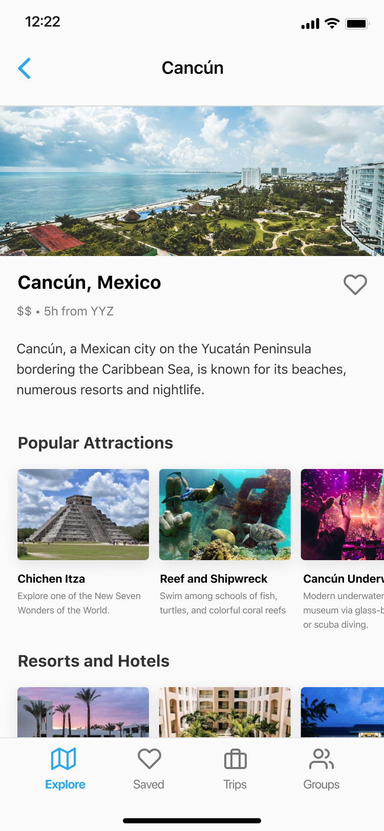
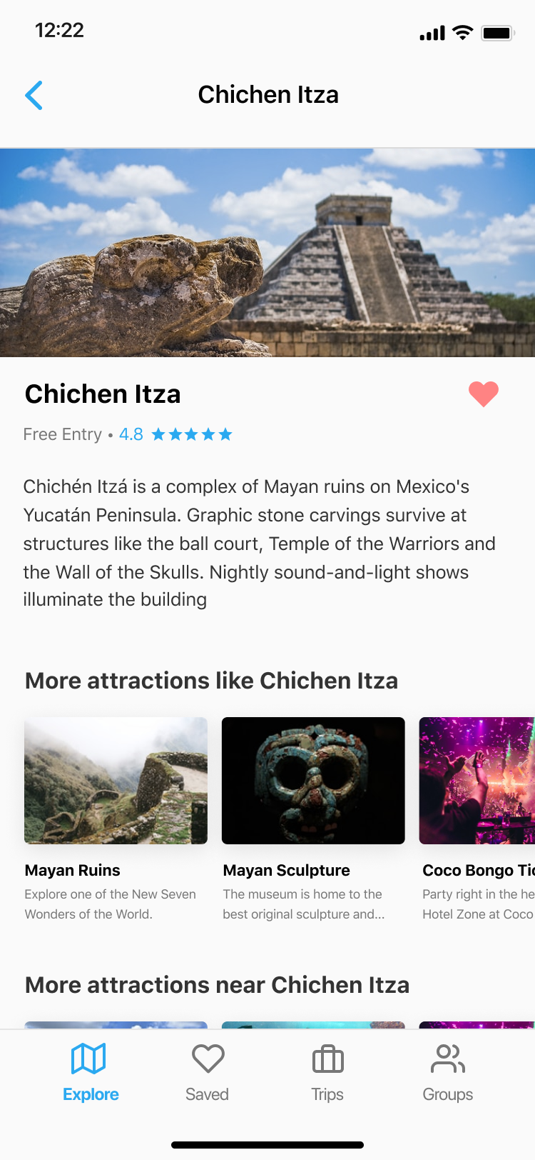
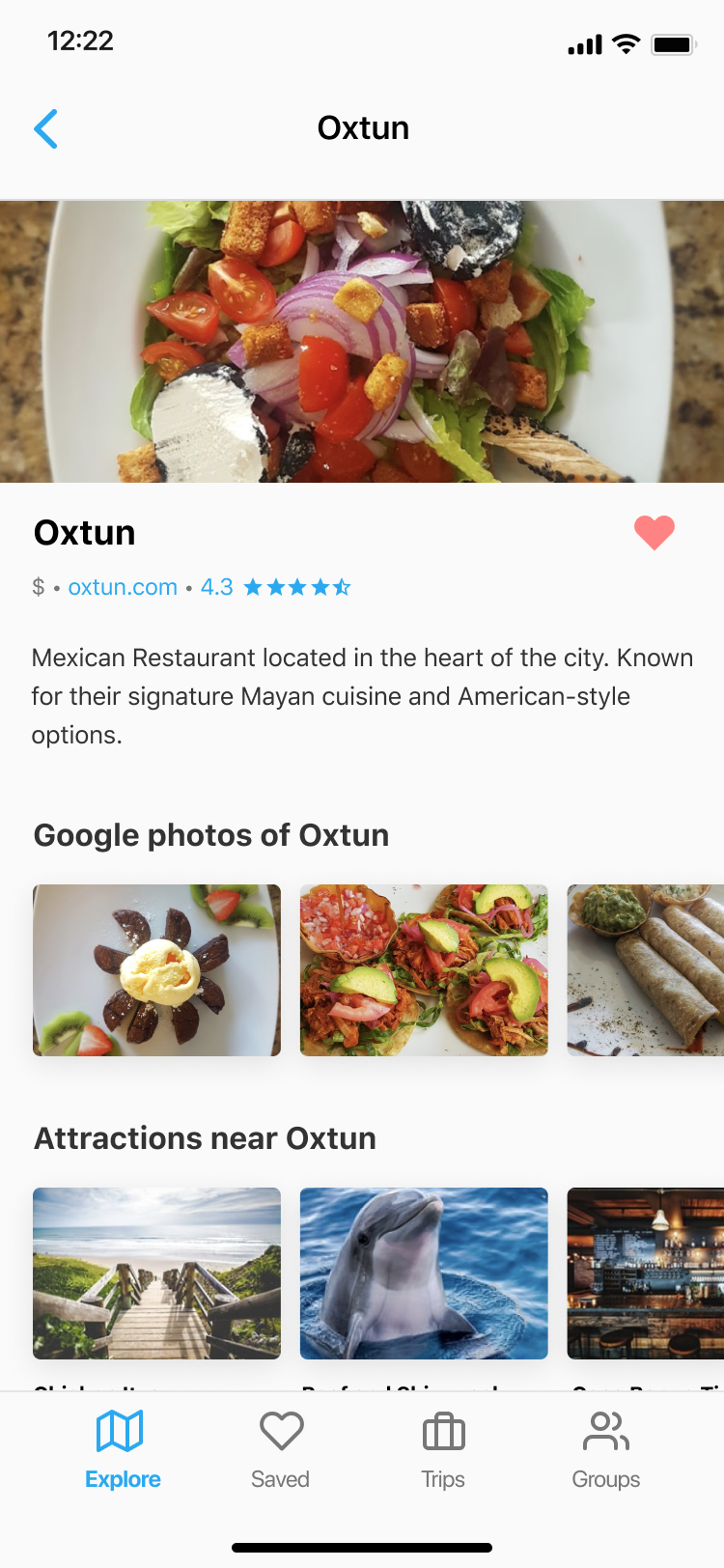
The following 3 wireframes (Cancun, Chichen Itza, and Oxtun) demonstrate the details page for locations, attractions and restaurants. By entering the Cancun page, the user can see popular attractions in the city that they may want to save, and in the attractions page, the user can view nearby popular restaurants they may want to stop by.
Finally in the saved tab, users can view the locations, places and restaurants they have “liked”, and a sticky CTA “Plan trip” is shown. When tapped, users will be able to create detailed itineraries based on the items of their saved list.
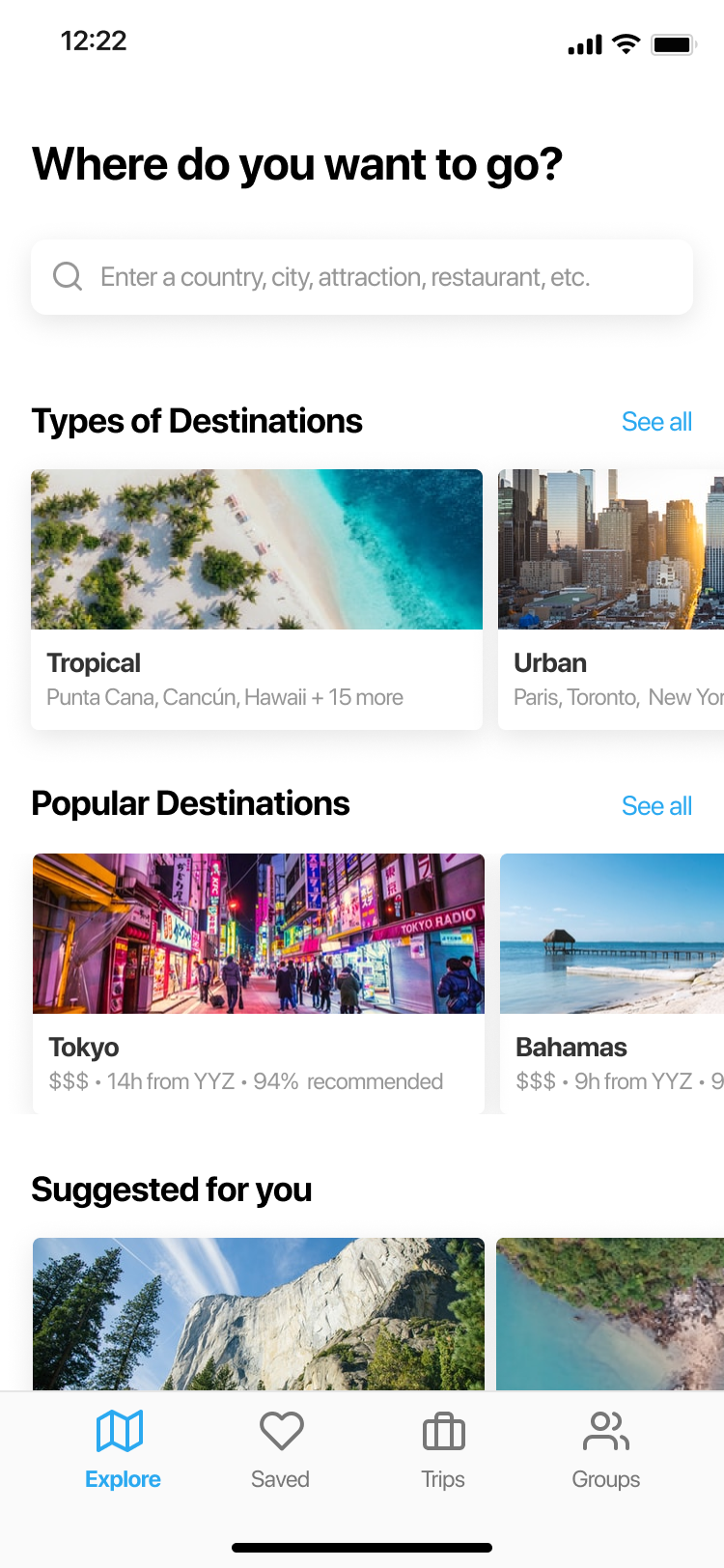
This is the first page that is shown when a user opens the app. It’s focused on discovery of travel destinations, categorizing places by the type of destination, popularity, and so on.
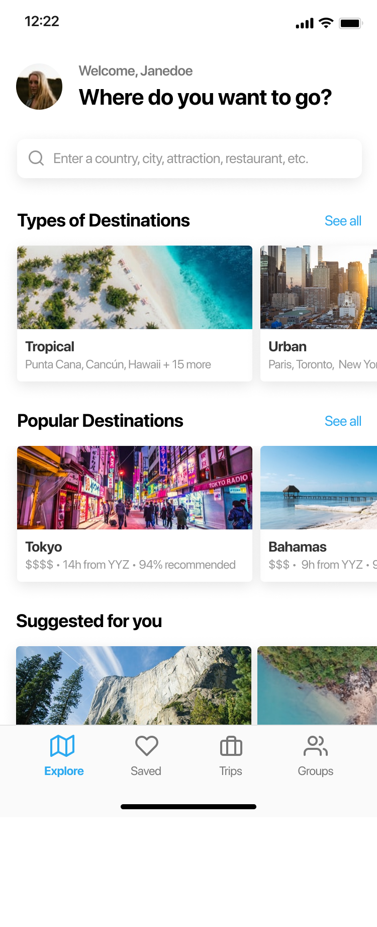
Building off the first iteration, this design allows for a more personalized experience and also lets the user easily access their profile. With this approach, the categories shown below will be more personalized to the user based on their saved items and interests. Additionally, the question “Where do you want to go?” is now paired with a greeting to welcome the user.
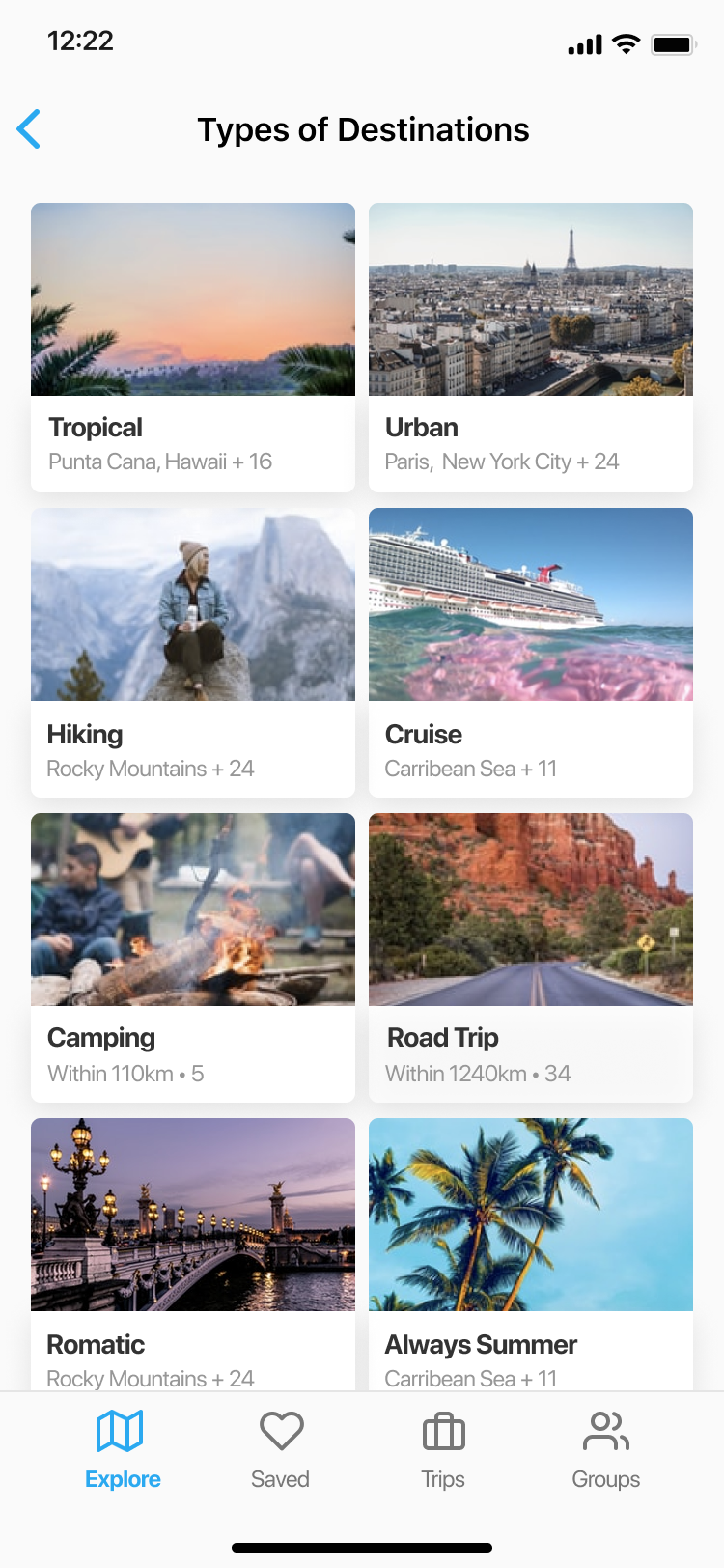
This page groups by the nature of the location, for example tropical or urban. The idea behind this decision is that users may have a general preference for a type of vacation or trip, and want to explore all their options. A grid is used to display as many types as possible to show the variety of locations on the platform.
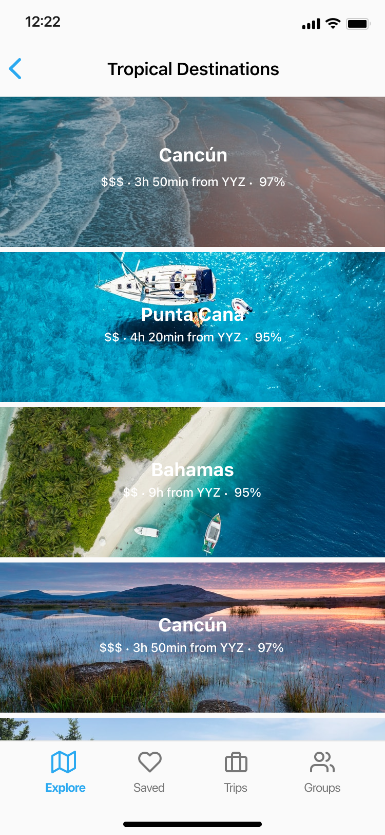
In this page, specific locations that are considered tropical are shown. This first iteration focuses on maximizing the size of the image for each location as images are an effective and captivating way of showcasing each place. The metadata of each location is the relative price represented with the dollar signs, the estimated flight distance from the user’s nearest airport, and a general rating of the location.
Strengths
Limitations
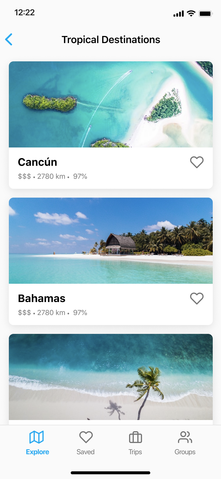
This iteration also shows the image of each location in full width, however now has the information shown underneath over a white background. This ensures that the text is always legible and accessible.
Strengths
Limitations
These are the detail pages for destinations, as well as their attractions such as restaurants, activities, and resorts. The user is able to favorite locations and attractions with the heart icon, which adds them to the “Saved” tab. As the user scrolls, related and nearby attractions are shown to help the user plan their trip.
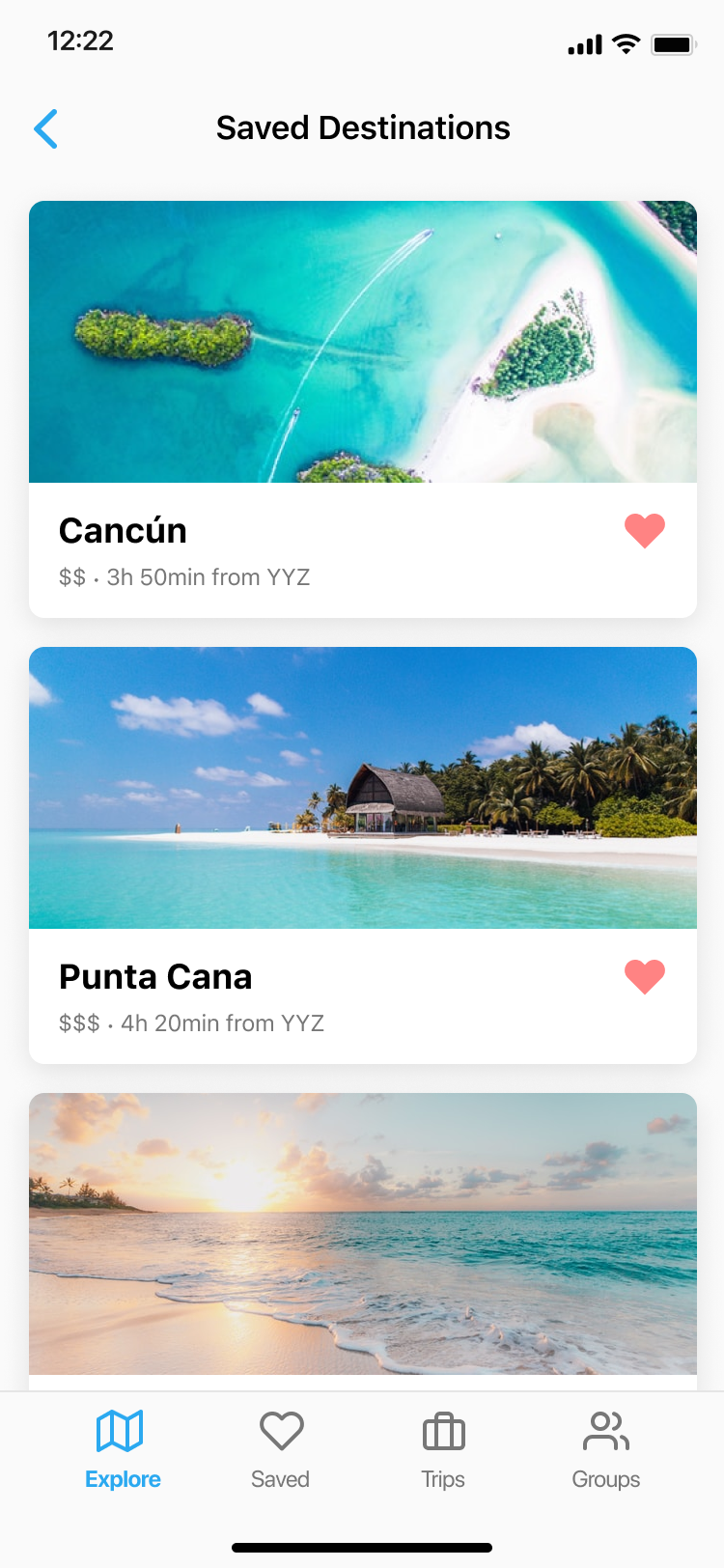
This is the first page shown on the second tab that shows a list of all the user’s saved locations. For example, if a user taps the heart icon for an attraction in Cancún, Cancún would be shown in this list, with the attraction shown in the saved location details page.
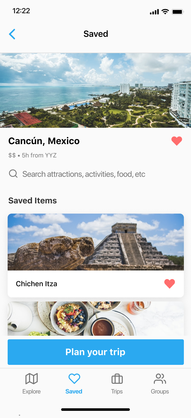
This page shows the saved attractions in the particular location, with a CTA to plan a trip. This action of planning a trip is currently being designed, and will result in flexible itineraries which will be in the Trips tab.
Working on the Wanderlust app taught me a lot about product strategy (how my designs would actually be built by developers, how it could generate revenue, etc.) and iOS design patterns. One of the takeaways from this project is the importance of user research. It is difficult to know the thought process of how people tend to plan trips, from the destination, to choosing attractions and restaurants. This is further complicated by the fact that people have varying ways of planning trips. While I spoke with potential users among my peers, a more rigorous user testing method would have helped guide the design process and lead to stronger conclusions. Another takeaway is that while it is important to deeply understand design patterns of specific platforms such as iOS, it is also important to consider other platforms and how the design would adapt to them.
The next step for this project is to run user testing sessions with the Figma prototype, as well as designing the scheduling flow allow users to turn saved items into a complete trip in the app. A social feature would also be added, which would allow multiple users to collaborate on the same trips.